Owner, Contributor
Length
3 months
Team
Team of 3
Year
2023
As a product designer, I was a core contributor in a design system revamp. Our product needed a robust design system to improve our design-to-development process, product cohesiveness, and scalability. I contributed to the design system implementation from the ground up, from style guide creation, component crafting to documentation and onboarding. We aimed to provide a single source of truth for components for designers and developers, eliminating the need for detachment and one-off solutions.
The Problem
The lack of a design system led to increasing tech debt, one-off components,
and a limited style guide that frustrated users and the team.
Our primary objectives were to optimize efficiency in design, handoff and accessibility, reduce design turnaround times, and empower designers to focus on creativity rather than repetitive foundational work by creating a design system from scratch. I contributed to a style guide with colors, typography, layout grids, and over 50 components with full accessibility in light and dark mode. I oversaw its implementation, onboarding, and documentation, with the system resulting in reduced design turnaround time by 75%, reduced 357 excess components to 73, lower detachment rate, and a smooth handoff process.
🔍 Complete Figma ->
Research & Discovery
The original design system had component
inconsistencies and missing states
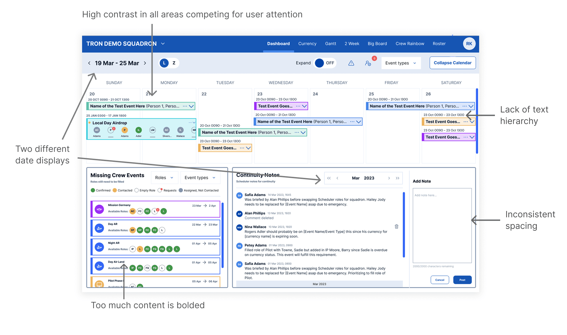
In a collaborative team meeitng, we identified shared challenges in our design process and system, such as missing component states, mostly detached and one-off components in designs, inaccessible colors, text styles being used in places they weren't supposed to, components not up to date, etc. To address these issues, we initiated a collaborative effort with management to outline a plan and gain buy-in from stakeholders, emphasizing the importance of this as an official project.
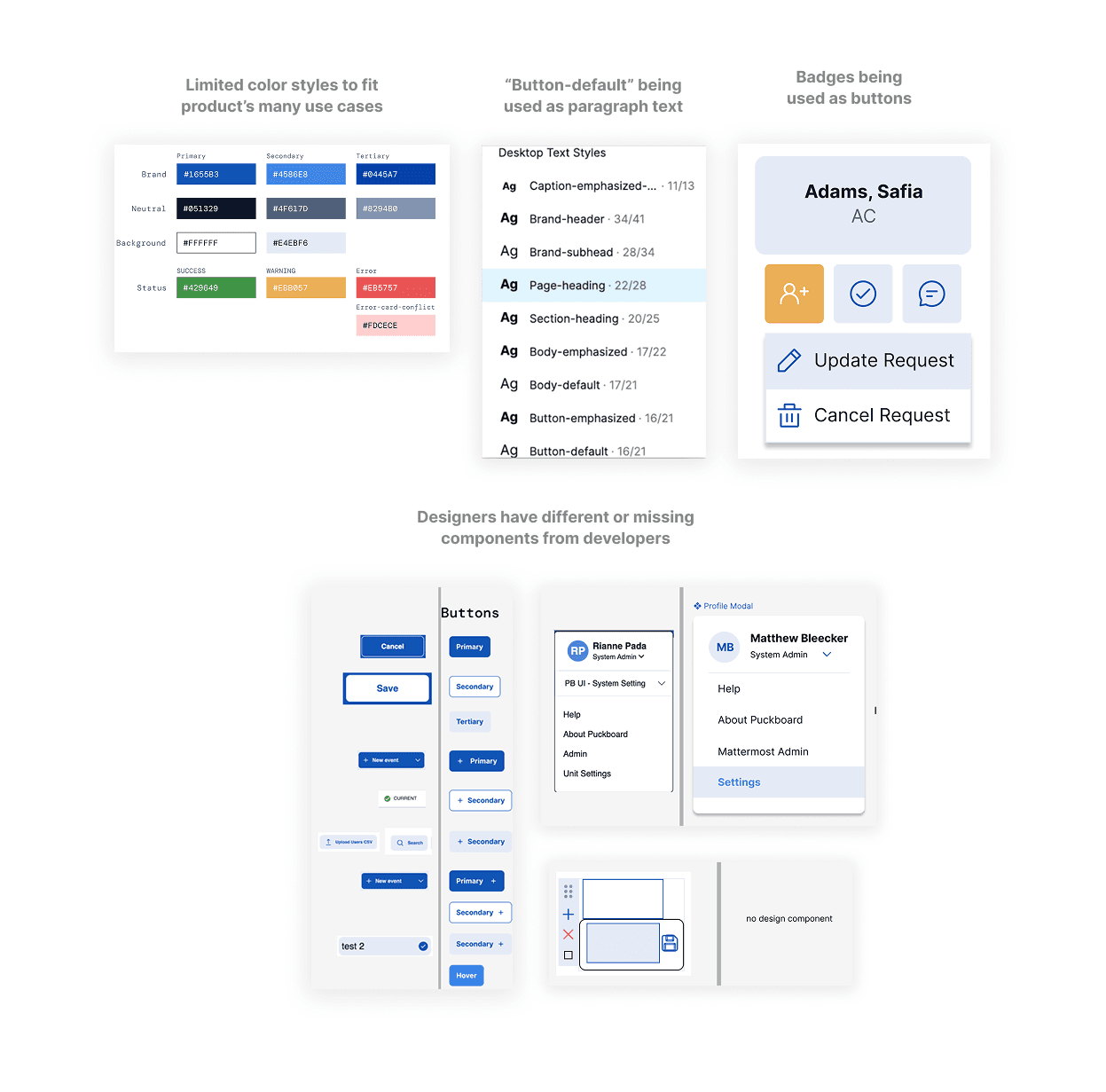
Observations of the original design system being used in the scheduler dashboard:
Design System Creation
Design systems are for the people
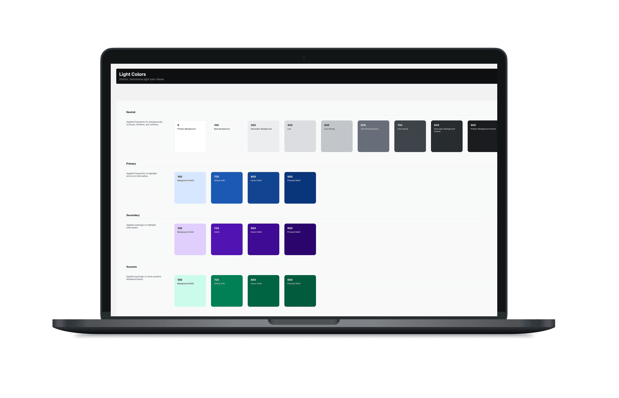
Our comprehensive design system encompassed various elements, including an icon library and style guide that defined typography, color palettes, container styles, elevation guidelines, and responsive layout grids.
The design system also comprised a wide range of meticulously crafted components from input fields and buttons to headers and tables. Each component included its properties and various states to ensure consistency and ease of use across our projects, as seen below.
For variables, we started building out primitives by using the blue/700 naming conventions, then semantic levels to explain the use cases with names like brand-primary/background.
Button Properties
Dropdown Properties
We wanted to provide documentation to serve as a design system resource for designers, developers, and other team members, promoting better communication and understanding. I owned and created a document on confluence and displayed each component’s anatomy, states and detailed descriptions of each. Each component in figma would be linked its section of the documentation for easy access. This would be helpful when onboarding new designers onto our system to understand and integrate as well.
[picture here]
This significant project of course brought along a steep learning curve and engaging the entire design team in our process presented challenges. We were seeking feedback on component creation and style guide development by walking through them. Keeping our two-month timeline in mind, we learned to navigate conflicting feedback. We hosted 1:1 feedback meetings for more directed, efficient feedback and prioritized what was most beneficial to our project's progress to effectively make decisions and move forward.
Documentation and Guidelines
A single source of truth for current and new
developers and designers
We wanted to provide documentation to serve as a design system resource for designers, developers, and other team members, promoting better communication and understanding. I owned and created a document on confluence and displayed each component’s anatomy, states and detailed descriptions of each. This would be helpful when onboarding new designers onto our system to understand and integrate as well.

Implementation & Adoption
Led system rollout, onboarding, and training to
whole design team
As our new design system marked a significant shift in our design process, it was crucial to address our design team's questions comprehensively. To facilitate this, we organized an interactive onboarding presentation with a playground in figma for designers to explore the new system by recreating our product pages. We conducted multiple office hours, and hosted Q&A sessions upon introducing the system to the entire team simultaneously.
Implementation & Adoption
New design system led to positive impacts on our
team & company
Some powerful impacts include…
✨ Reduced design turnover from 4 days to 1
✨ Reduced components from 357 to 73
(700 variants, 1400+ combinations)
✨ Reduced icons from 469 to 73
✨ Full accessibility in light mode and dark mode
✨ Reorganized figma file structure and successfully helped persuade leadership to upgrade to Enterprise for analytics
✨ Added hover, selected, focus, disabled, error states
✨ Decreased detachment rate
✨ ✨ Full accessibility in light mode and dark mode
A coworker's feedback after using the new design system for her work:
If we had the tools to track more metrics after release, I would…
Conduct usability testing to compare task completion and time on task rates to demonstrate improved usability.
Measure the time it would take to develop new features.
Collect user feedback through surveys or feedback forms to gauge user satisfaction.
Evaluate any improved accessibility scores by using WCAG compliance levels metrics.
Learnings & Reflection
Challenging projects lead to self discoveries
Building a design system contributed foundational knowledge to my skillset.
Over the course of this two-month project, I encountered challenges that spurred significant personal growth. I acquired a deeper understanding of component design, discovering how component properties enhance both efficiency and adaptability for various use cases. Additionally, I honed my skills in crafting color palettes and leveraging brand colors to create impactful designs. Drawing inspiration from existing design systems, I expanded my toolkit with valuable design techniques and resources.
I enhanced my adaptability and design process confidence in a fast-paced environment.
I discovered my ability to learn and adapt quickly to frequent challenges. The project's tight deadline required rapid learning of foundational concepts and applying new knowledge immediately. This experience had boosted my confidence in tackling more complex design projects and overcoming to new challenges, highlighting my potential for further growth in the field.


