UI/UX Designer
Length
2 weeks
Team
Individual
Year
2022
Amplitude is a B2B product analytics platform that helps companies build better products. It powers over 40,000 products from 180+ countries around the world. The product has tracked over 28 trillion user actions to help digital product and growth teams instantly understand user behavior, build engaging experiences, and grow their business.
From May to August 2022, I worked on four projects which consisted of:
Shipping a refreshed onboarding flow, positively impacting customers when signing up for an Amplitude account
Delivering new user email and signup screens for inviting new users to join their team to increase usability
Iterated on alert notifications and settings page view notifying users about our event policy
Redesigned a settings page to increase discoverability
Introduced a new user onboarding checklist and tours of important features
The original signup flow lacked consistency, clarity, and had an above
average user drop-off rate.
The Problem
Product Overview
I improved the signup experience by incorporating more consistency and clarity for users throughout the process. The email templates were redesigned with intent of increasing engagement, incorporating more engaging text and visuals. This project can be seen live at Amplitude.com!
While I can’t disclose all the details of my project due to the NDA, I would be glad to communicate more information in interviews!
Research & Discovery
User bounce rate kept increasing as the flow
progressed
The onboarding process for a new user signing up for the first time consisted of clicking on "Get Started", entering in data in the order of email, user name, team, role, company's name/size/location, password, and organization, with 8 total screens.
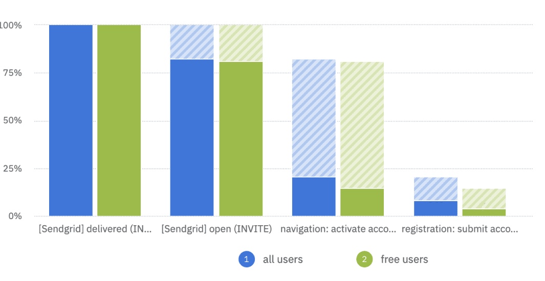
Our product's own quantitative data allowed us to see our signup flow's research data instantly in detail.
The bulk of the problem was the email verification step - users weren't returning to the website after being redirected.

My overall weekly step-by-step process went like this:

Design Workflow Improvements
Providing a clear, concise, warm onboarding
experience was the end goal
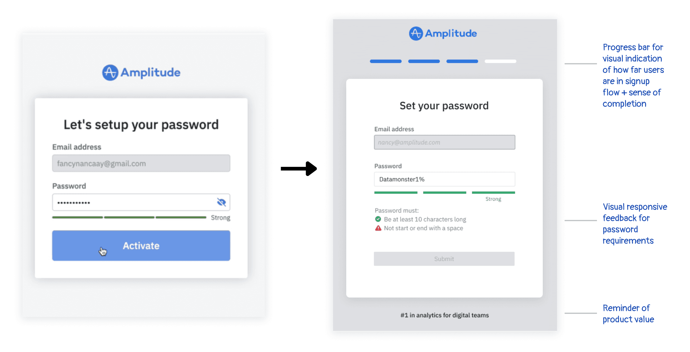
After multiple weekly meetings and feedback sessions with cross-team designers and my team, I had my final design solutions. I condensed some screens together, introduced a progress bar give clarity and a status to the user on where they were in the signup process. Illustrations, more personalized and clear copy, help guides, consistent boxes and call-to-actions have also been updated.

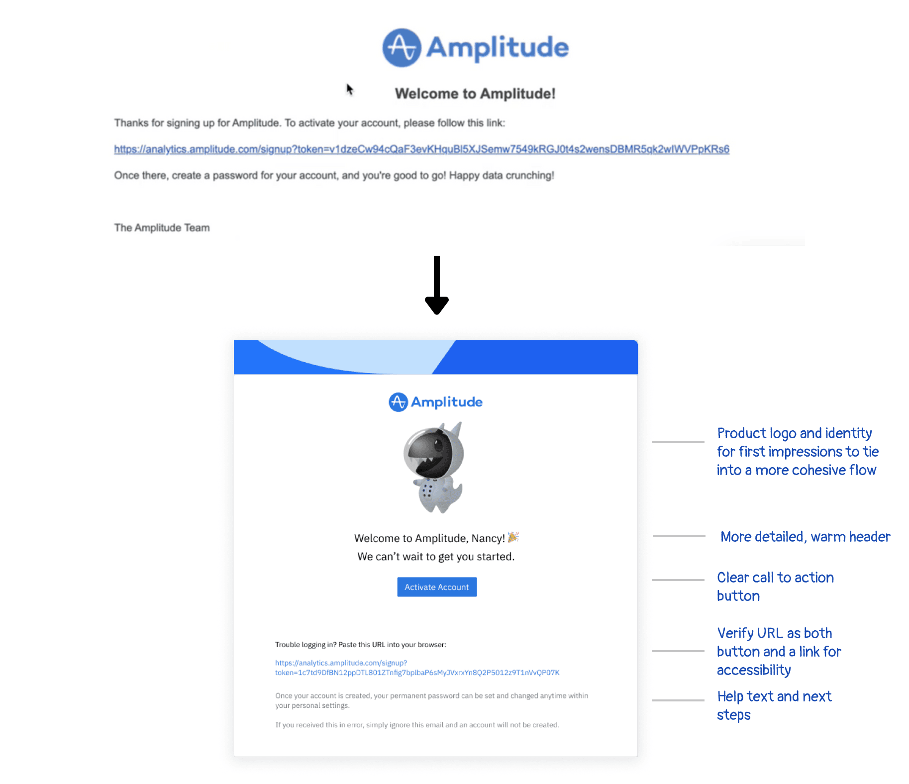
The old to new email I worked on was a complete redesign, using the brand mascot Datamonster, personalized descriptions, help links and text, and clear CTAs.
This redesign allowed for my team to use this template I made for future email refreshes with its success in decreasing drop off.

Specifically for the updated set password screen above, I collaborated closely with the engineer on my team to discuss what requirements can be displayed to the user and to incorporate error states. This solution provides more feedback and visual help, giving more room for a quicker process.
We had just launched a new feature, which allowed new users to join their existing organization who had already signed up for Amplitude. Collaborating with another designer and product manager, we aligned on a solution that displayed all possible organizations with example members.
Results After Release
✨ The conversion rate of the signup funnel had increased by 2x in success for signups.
✨ Revamping the email verification made the largest change, decreasing the drop off rate by ~10%.
Learnings & Reflection
Key Takeaways
💫 Prioritize feedback from team members early.
This summer and these projects are definitely an experience to remember forever. I'mgrateful to have absorbed so many new insights about the ever changing world of design from my great community of team members. I did not expect to have grown so much professionally and learn about myself with different perspectives.
💫 Design is an ever changing, iterative process.
Any successful mobile app or web platform has been through multiple iterations, and some even through decades. Design is a field that always has projects that are never fully finished and are revisited again many times. While working on my projects, I expected some iterations to be the one that ties all the designs together, but there
is always some aspect that could be improved. I've learned to check in with the improvements I've made for the project goals, feeling confident in my designs. Keeping the time constraints and developer schedules in mind, I was able to leave off at a good point with my team.


